
Oil Pattern Graphs: KOSI Composite Graphs
How many times have you gone to a bowling tournament, or even a bowling league, and seen a lane pattern graph and not known what in the world you were looking at? I was at a collegiate bowling tournament where lane graphs were given to the teams at check-in and I heard many a team trying to decipher what the lane graphs meant. Over and over, I heard teams trying to decide where to play based on the lane graph. It actually surprised me how many people didn’t know what to look for.
If you are like me, and I know there are many of you out there, when you look at a lane pattern graph, you don’t really know how to extract information from it. Basically, you’re just looking at a picture of a lane or worse, some lane tapes that might as well be written in an ancient language. To help you, I have consulted some of the top minds in pattern theory for a little lesson in how to read and understand the various types of lane graphs.
To begin, we must first understand that there are different types of lane graphs. Some are related to the lane machine program sheet and some are related to the actual oil pattern on the lane.
Calculated from the lane machine settings (the program that is entered into the lane machine), we have the overhead graph and the composite graph. From lane tape readings (taken directly off the lane from the oil itself), we might see the 3D graph or the 2D graph. Each of these graphs look different and provide different ‘views’ of the oil pattern, but ultimately they all give you the same basic information – the shape of the oil pattern.
Some of the information you should look for, regardless of the graph type, is pattern distance, pattern volume, inside/outside ratios (don’t get confused, we’ll discuss) and pattern shape. All of these things will provide clues about what to expect from the oil pattern.
Pattern distance tells you how long (or short) the lane pattern is; in other words, how far down the lane from the foul line the oil is applied. A short pattern will play much different than a long pattern simply because there is longer part of the dry lane to deal with.
Pattern volume tells you how much total oil is applied to the lane. It does not tell you where that volume is; only how much oil is there. The total volume of oil is measured in milliliters and per board values are measured in microliters.
When you see a graph with units as the value, it is a calculated measurement based upon the ultra violet additive (UV) that is mandated to be in each batch of lane oil. The UV additive allows the optical lane reader to “see” the oil. Units of oil should not be confused with volume of oil.
Ratios tell you the difference in the amount of oil from left to center and right to center. Pattern shape is the shape of the oil on the lane. Some examples of shape are top hat, block, Christmas tree, or flat.
The first type of graph we’ll study, the composite graph, is one that most people will see most often. The composite graph is also called a volume per board chart. The composite graph, shown below, gives us the total amount of forward and reverse oil that is applied to the lane. The total amount of applied oil is calculated based on the program that is entered into the lane machine.
In actuality, the composite graph shows us the amount of oil on each board. The best way to understand the composite graph is to imagine taking all of the oil that was applied to the lane, then drag it back to the foul line and stack it up. This would look like the composite graph.
Take a look at the composite graph example below.
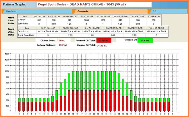
Along the bottom, or the ‘x’ axis for you math people, you can see the lane boards labeled; board one on the left to 20 in the center to the one board on the right.
Along the side, or the ‘y’ axis, the amount of oil is measured in micro liters.
This particular example is the composite graph for Dead Man’s Curve, a Sport pattern in the Kegel Navigation Series. Sport Bowling uses ratios to describe (or define) the level of difficulty of a pattern; a lower ratio is more difficult than a higher ratio. The Sport Bowling ratio is defined as the average amount of oil (in units) between boards Left 18 to Right 18 divided by the average amount of oil (in units) between boards R3-R7 & L3-L7, respectively.
While this graph does NOT give us units, nor does it tell us exactly where the ratios are within the oil pattern, it is still a good reference. In this graph, we can see that there is about three times as much conditioner in the middle of program as there is on the left and right side of the program; a 3 to 1 ratio.
The chart area above the graph, which you may or may not see on a composite graph as it depends on how the graph was generated (which computer software program generated the graph), also gives information on ratios in different parts of the pattern program. It may be somewhat difficult to read in this example due to the size of the picture; however, some information about ratios around the track area is given.
The track area is generally defined around the 10-board on either side of the lane (typically a bowler will play the track on a house shot). In this example, ratios are given for outside the track (boards 3-7 on either side of the lane), middle track (boards 8-12 on either side) and inside track (boards 13-17 on either side). In general, the lower the ratio of the oil, the more difficult the pattern will be to play.
In this example, the inside track (boards 13-17) would be very difficult as it is basically flat with a 1:1 ratio whereas the outside track (boards 3-7) would be somewhat easier at a 3:1 ratio. To put the ratios into perspective, a house pattern might be 6:1 or even higher. A high ratio program, like many house patterns are, will give the bowler a defined “ridge” to play against within the oil pattern.
This difference can help you determine how best to play the lane. Don’t misconstrue that; the composite graph can give you an idea of how to play the lane, but a common misconception is that it can tell you where to play the lane. This isn’t always true since the topography of the lane surface can often be more dominant than the oil pattern.
The composite graph is more of an idea of how difficult, or how easy, the oil pattern may play. Again, generally the lower the ratio of conditioner from the inside to the outside, or the flatter the oil pattern, the more challenging the oil pattern will be.
The last things to note in this graph, and they may be difficult to read because of the graph size, are the pattern distance and pattern volume. In this particular example, the pattern distance is 43 feet and the total volume is 24.25 mL.
Since a lane is 60 feet from foul line to head pin, there is 17 feet of ‘dry lane’ after our 43 foot Dead Man’s Curve pattern. That basically means there is 17 feet of friction that the ball must move through before it hits the pins.
We hope this information has helped you understand how to read a Composite Graph. It is important to remember that the information is only as useful as your interpretation. The graph isn’t telling you where to play; it is only providing you with some information to help you make an informed decision regarding lane play.
Next time, we’ll see another type of graph, learn about how to read it, and extract useful information from it. Until then, Happy Bowling!